

Real Problems.
Real Strategy.
Real Solutions.
Every project below started the same way every client project does which is understanding the business, the people it serves, and what the current website wasn't doing for them. These site designs for wellness businesses show what's possible, along with the thinking behind every decision.

Therapy
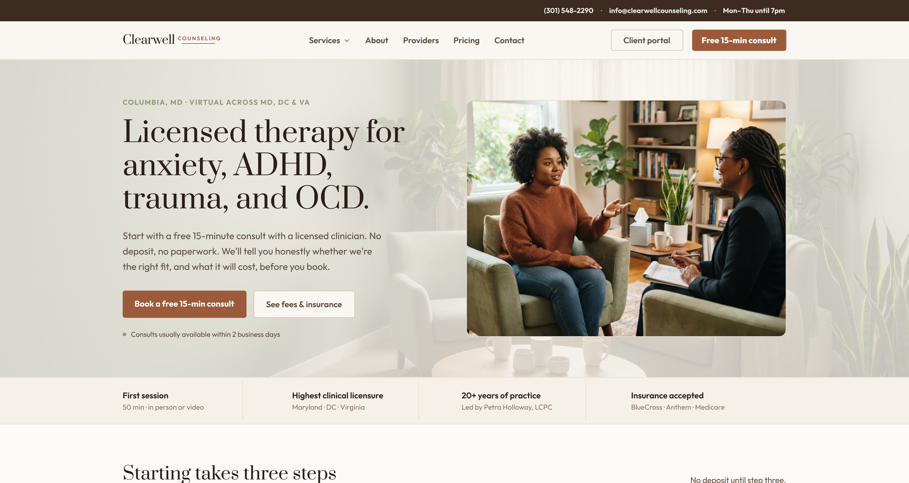
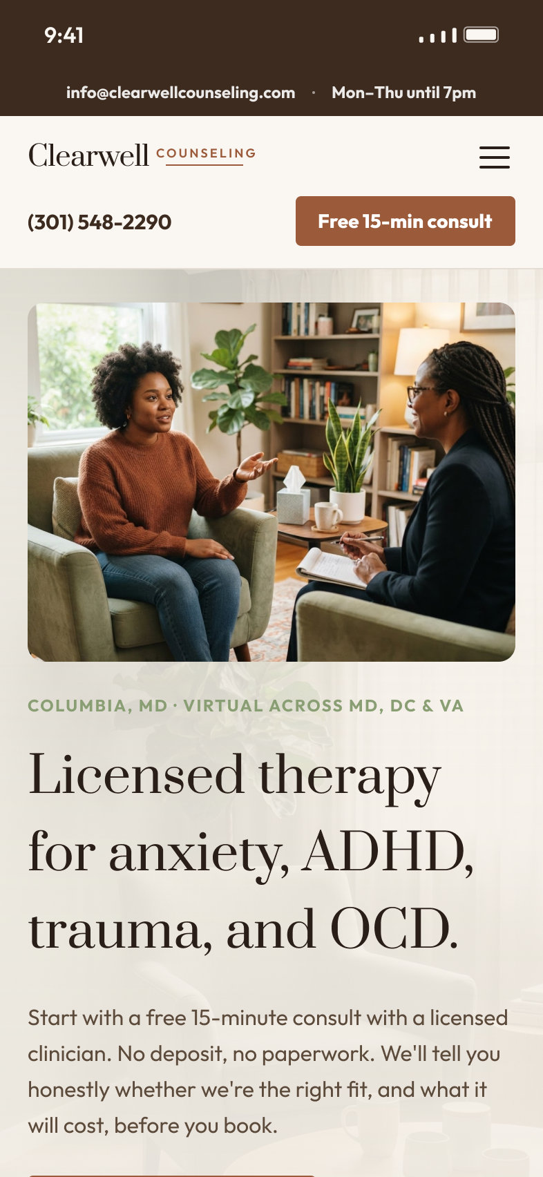
Clearwell Counseling
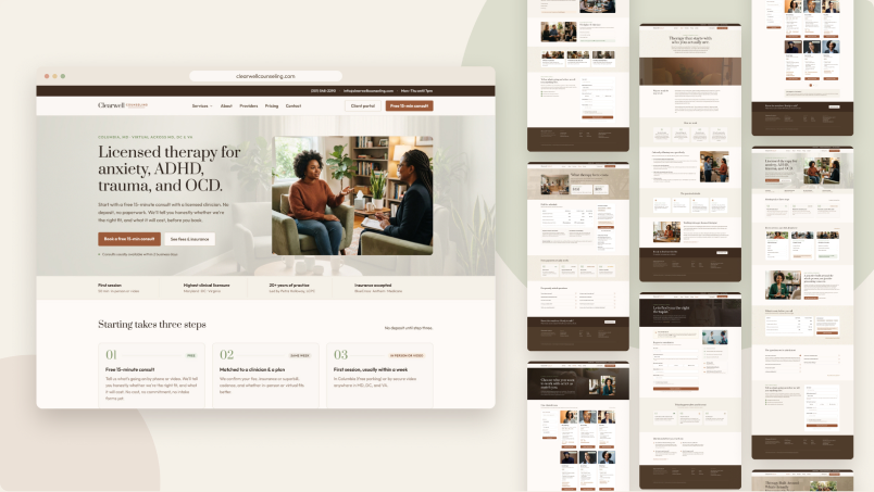
A calm, welcoming website for a group counseling practice. Designed in Figma and built in Webflow with a CMS-powered provider directory, a services mega menu, and thoughtful page interactions.
The Problem
Looking for a therapist is stressful, and many counseling practice websites make it harder. People arrive anxious and unsure what they need. They usually have three questions:
“Can someone here help me?”
“What will it cost?”
“What happens after I reach out?”
On most practice sites, the answers are spread across dense pages, hidden behind phone calls, or missing entirely. Fees are often vague, provider bios are hard to compare, and the next step can feel like a big commitment. For a group practice with several clinicians, the problem grows. Visitors have to work out on their own which provider fits their needs, schedule and insurance, and many leave before they ever book a consult.
The Strategy
I set out to design a site that lowers the emotional and practical barriers to starting therapy. The guiding idea was to answer the hard questions early and plainly, so visitors feel informed instead of sold to. That led to four priorities:
- Clarity about cost. Fees, insurance and out-of-network options would be easy to find, with a dedicated pricing page and fee notes linked wherever cost comes up.
- Help finding the right fit. Instead of a static list of bios, visitors would get a provider directory they could search and filter by specialty, availability and session format.
- A low-pressure first step. Every page would point to a free 15-minute consult, and the process would be laid out in three simple steps so nothing feels uncertain.
- A calm, warm visual tone. Earthy colors, a refined serif paired with a friendly sans serif, real-life photography and gentle motion would make the site feel like a safe place rather than a clinical one.
The Solution
I designed the full site in Figma and built it in Webflow using the Client-First framework. It has six pages: Home, Services, About, Providers, Pricing and Contact.
- Provider directory: It's powered by the Webflow CMS, with live search, specialty filters, availability badges and pagination. When a visitor picks a provider, they go to the contact form with that clinician already selected, so the request is ready to send.
- Services mega menu: Visitors can see every area of care at a glance and jump straight to the one that fits.
- Pricing page: It sets out session fees, insurance details and superbill guidance, supported by an FAQ that answers common questions before anyone has to ask.
- Consult flow: The free 15-minute consult appears throughout the site, with a clear “what happens next” sequence on the Contact page.
- Thoughtful interactions: Scroll reveals, card hover effects, a sticky “Why we work” section and smooth accordions make the site feel polished without distracting from the content.
- Responsive layouts: Each breakpoint was tuned on its own, from wide desktop screens down to the smallest phones, so the experience holds up on any device.
The result is a site that feels as supportive as the care it represents. Visitors can learn who the practice serves, find a clinician who fits, understand the cost and book a consult without having to guess.
Yoga Studio
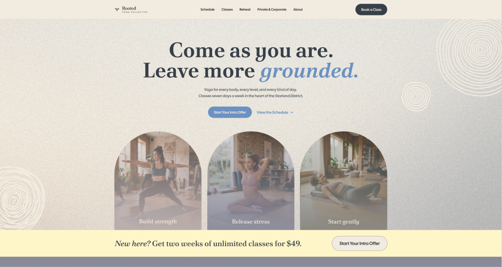
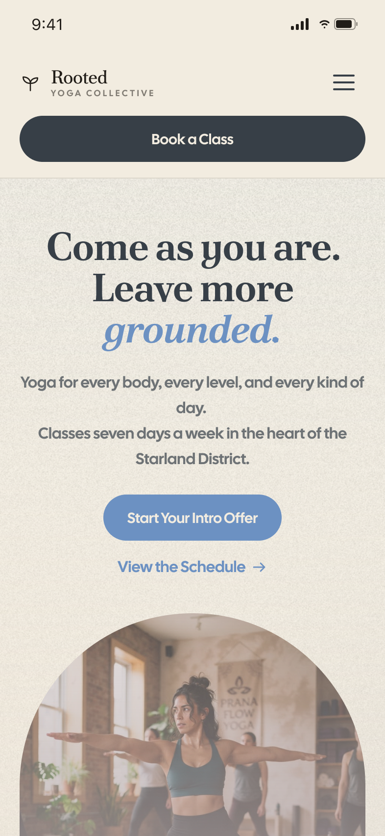
Rooted Yoga Collective
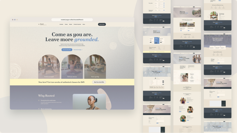
A calm, welcoming website for a yoga studio, built in Webflow with a class schedule, membership pricing, retreats, and an accessible FAQ. Reusable components, native forms, scroll and load interactions, and fully responsive.
The Problem
Many boutique yoga studio websites make new students work too hard. Class schedules are buried in third-party booking widgets, pricing is split across several pages, and the photos and copy often show one narrow idea of who yoga is for. For someone who has never practiced, or who has felt out of place in a studio before, that friction is enough to close the tab.
Rooted Yoga Collective is a concept for a studio in Savannah's Starland District, founded by a former nurse. The goal was a site that answers a newcomer's real questions before they ask them:
“Will I belong here?”
“What should I take first?”
“What does it cost?”
“What happens when I show up?”
It also needed to support the studio's broader business, including memberships, retreats, and private and corporate sessions, without overwhelming first-time visitors.
The Strategy
I organized the site around the two audiences who matter most: nervous beginners and returning members.
- Lead with belonging. The messaging centers on “Come as you are,” with diverse photography, teacher bios that feel human, and a founder's note that explains why the studio exists.
- Make the next step obvious. A $49 two-week intro offer appears in the hero, in a dedicated banner, and in the footer. Booking buttons route to a single contact page so the path stays consistent.
- Choose classes by feeling, not jargon. Classes are grouped by intent: build strength, release stress, start gently, and support your pregnancy. Each class includes a plain-language “Leave feeling…” description.
- Remove first-visit anxiety. A step-by-step “what happens after you book” pattern repeats across key pages, and a dedicated First Visit page covers what to wear, what to bring, parking and accessibility.
- Be transparent about pricing. Memberships, class packs and the community rate all live on one clear pricing page with no long-term contracts.
- Respect privacy and access. The contact form reminds visitors not to share health details. The FAQ addresses body size, flexibility, pregnancy, HSA/FSA eligibility and accessibility directly.
The Solution
I designed eleven pages in Figma and built them in Webflow using the Client-First naming system, with reusable Navbar and Footer components so updates carry across the whole site.
- Home: a welcoming hero with arched class photos, a “classes today” schedule preview, quick entry points for new students, members and corporate clients, testimonials with animated stat counters, and teacher highlights.
- Schedule, Classes, First Visit and Memberships: a focused path from discovering classes to choosing a plan, with consistent “View Times” and booking actions.
- Retreats and Private & Corporate: dedicated pages for higher-value offerings, including a native Webflow request form.
- About: the founder's story, studio values, a note on honoring yoga's South Asian roots, teacher profiles and a 14-question FAQ. The FAQ uses accessible accordions and includes structured data, so the questions can appear directly in Google search results.
- Contact: tap-to-call, tap-to-text and directions links, a contact form with a topic selector, and an embedded map with parking details.
The build includes load and scroll animations made with Webflow's native interactions, subtle hover states, and a CSS-only mobile menu. Every animation respects visitors' reduced-motion settings. Every page is responsive across desktop, tablet and mobile, with custom layouts at each breakpoint rather than simple stacking.
The result is a calm, cohesive site that feels like walking into a studio where someone already knows your name.
Physical Therapy
Lindyn Neurological Rehabilitation
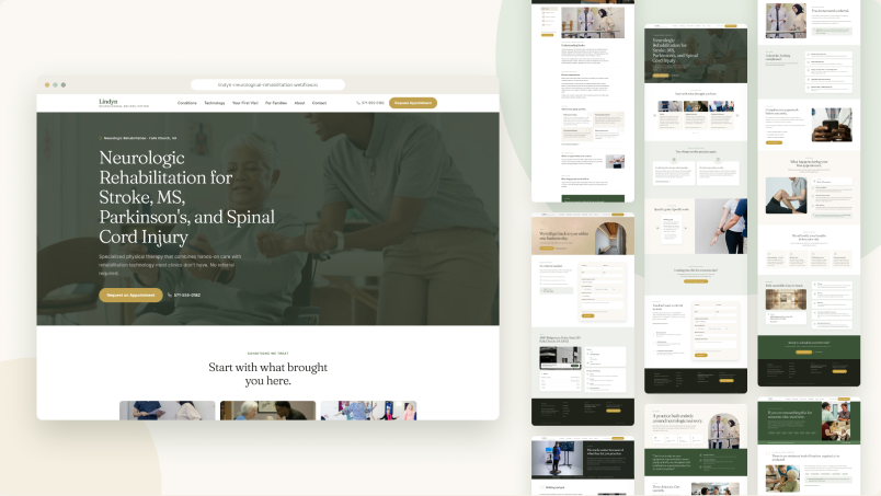
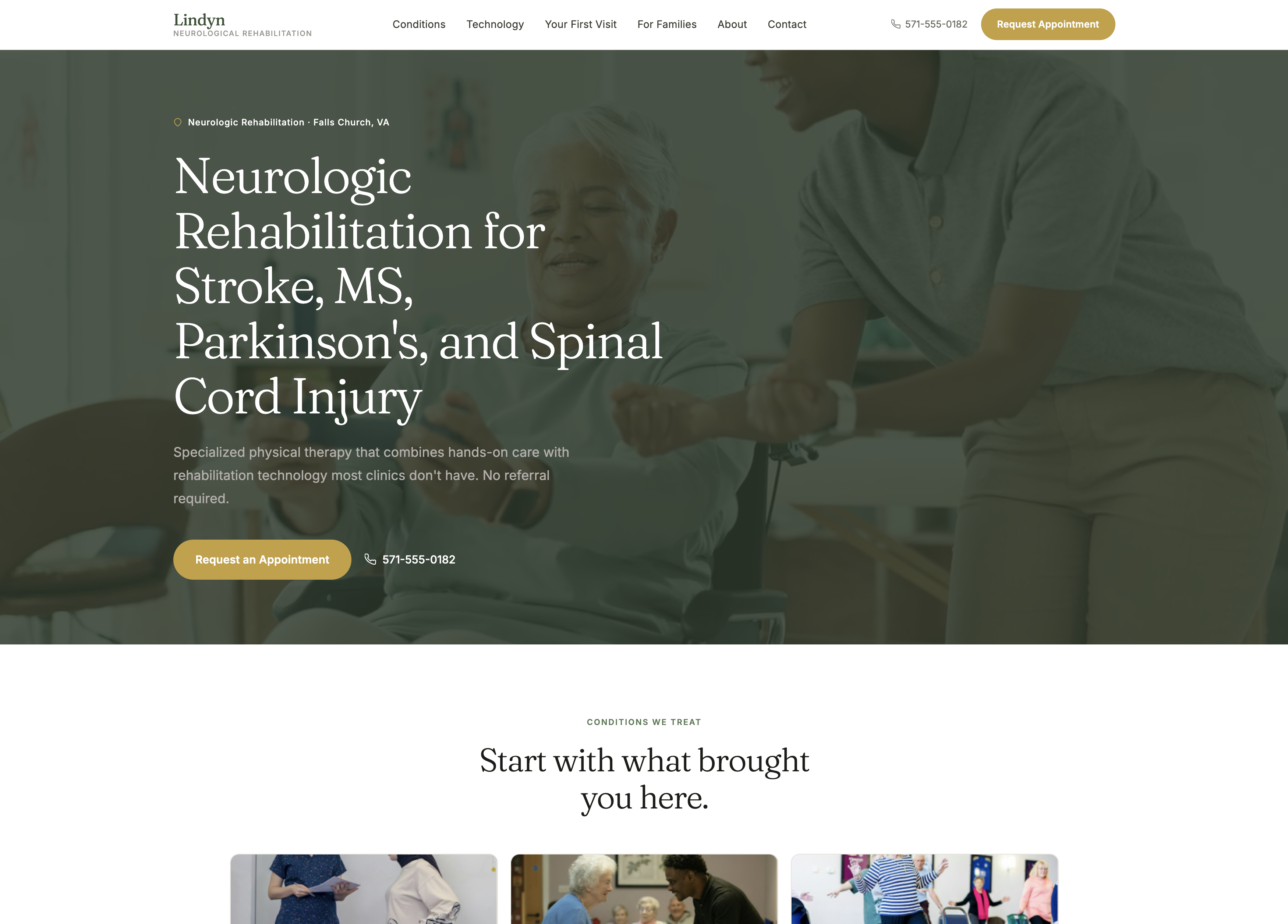
A website for a neurologic rehab clinic built for patients and families. Includes a CMS conditions library, a video hero, sticky navigation and scroll animations.
The Problem
People who look for neurologic rehab are rarely browsing casually. Most are recovering from a stroke or brain injury, or living with MS, Parkinson's or a spinal cord injury. Just as often, the person searching is a spouse or adult child trying to make a decision quickly. Many rehab clinic websites aren't built for that visitor. They lead with general orthopedic services, put the specialty care several clicks deep, and leave the big questions unanswered:
“Do I need a referral?”
“What happens at the first visit?”
“Is this place right for my condition?”
I designed Lindyn Neurological Rehabilitation, a fictional outpatient clinic in Falls Church, Virginia, to show what a specialty practice site looks like when it's built around those questions instead of a generic services list.
The Strategy
I started by mapping the two audiences: patients and the family members who often research for them. Every page needed to answer one main question, so the site map follows the decisions a visitor makes in order.
“What do you treat?”
“How is your care different?”
“What will my first visit be like?”
“How do I support someone going through this?”
That led to a few key choices:
- Organize the content by condition, not by service. Each condition gets its own page, so a visitor can find their diagnosis in one click and see the goals, approach and technology that apply to it.
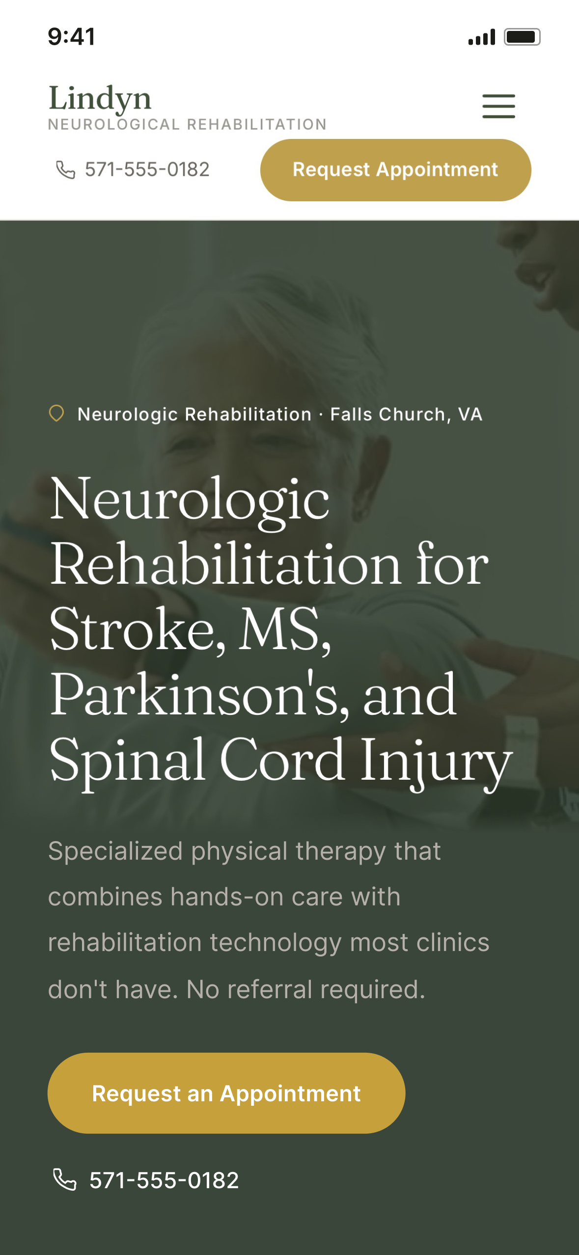
- Remove friction early. “No referral required” appears in the hero, and the phone number stays visible in the navigation at every screen size, because many visitors would rather call than fill out a form.
- Give families their own page. Caregivers have different questions than patients. A dedicated For Families page speaks to them directly, without burying that content inside patient pages.
- Keep the visual tone calm. A muted sage and gold palette, Fraunces headings and generous spacing make the site feel steady and clinical without feeling cold.
The Solution
I designed the site in Figma and built it in Webflow using Client-First conventions. It has seven core pages: Home, Conditions, Technology, Your First Visit, For Families, About and Contact.
- CMS conditions library. Each condition page pulls from a Webflow CMS collection with a sticky side menu, so the clinic can add or update conditions without touching the layout.
- Video hero. A looping background video of a therapy session sits under a deep green overlay. A still photo stands in when the video can't load, and the video is hidden for visitors who have reduced motion turned on.
- Guided first visit. The First Visit page uses jump links and a sticky “What to Bring” checklist, so a nervous new patient can scan the whole process at a glance.
- Interactions with restraint. Subtle scroll reveals, hover states and an animated nav underline add polish while respecting reduced-motion settings.
- Responsive at every size. The navigation switches to a hamburger menu at 1152px. The phone number and appointment button stay visible on small screens, and every layout was tuned for tablet, mobile and the smallest phones.
The result is a site that lets someone in a stressful moment find their condition, understand what to expect and reach the clinic in just a few clicks.